Posted by Sting Communications on May 2, 2016 in Design

7 ways to give voice to your design with typography
1. Understand the basic font families
Typefaces or fonts are the set of alphabetic characters that contain a particular style of alphabets and punctuations. There are two broad categories of font families.
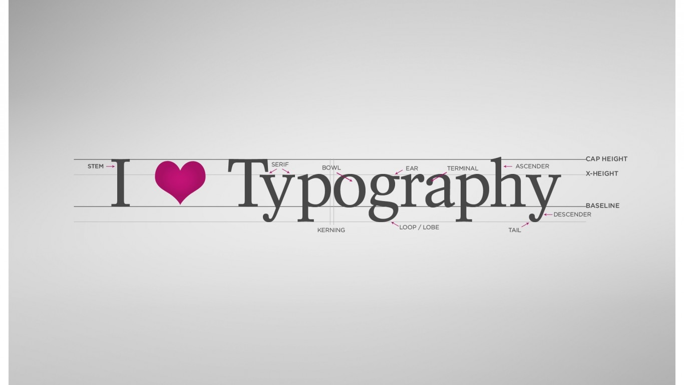
Serif – font styles with horizontal and vertical details that enhance the major strokes of a character.
Sans serif – are fonts without such details. Sans (French) means without. Other than these, each font family generally comprise of variations like regular, bold, italic and bold italic. Sometimes fonts have numerical numbers to signify the strength (weight) of a particular font.
The other different font styles are A. handwritten or calligraphic / script fonts – these are created on letterform of handwritings. Carefully judge the legibility of such script or hand written fonts. B. Monospace fonts : they are typefaces based on old typewriter system where each letter has a unique width and spaces around them. They can combine serif and sans serif characters. C. Novelty: Novelty fonts are spectacular and anything a bit bizarre may be considered as novelty. They are like fashion fonts that may loose acceptance after sometime and again resurface over a period. D. Ornament or Dingbat are fonts that use images instead of alphabets. They are primarily used as ready to use graphic elements by designers.
2.Understand point size
Points are the scale to measure the size of a font. To have a clear understanding as to how much point size of a font will look good in a particular design, you must first know what a point size signify. Consider 72 points as one inch o roughly 2.5 cm high. So 36 points will half of it like ½ inch or approximately 1.25 cm. like wise 18 point will again be half of 36 points. Usually in brochures we can use 10 to 12 points on continuous run on text matter and 16 to 18 points for headlines. But this entirely depends on you as how legible or strong you want to make your statement.
3. Beware. All fonts are not equal in height. A 16 point of Ariel is different from a 16 point of a script font. Using fonts in lesser points may reduce readability.
4. Understand the drawbacks of Reverse Text
Conventionally, it has been established that a black background to a white or light coloured text is less readable. But then you have to consider the look and feel of your design. If the TG seems likely to permit and favor this darker look you can go ahead. Remember to judge the length of the reverse as too long text in reverse may not look good. Printers prefer sans serif types in reverse as the fine details of serif are difficult to bring out in small typo printing.
5. Consider unconventional solutions while making the text stand out:
placing a message in the outer margins, using dimensional appearance, Spanning important text between columns are some ways to highlight text.
6. Follow the following Headline principles
A. Watch out for lousy typographic judgement of the computer. Your computer might break a word while going to the next line. B. Never use script and hand-lettered typefaces in all caps. C. Avoid vertical treatment until your client absolutely demands it. D. Rarely combine different seriff or san serif font families.
7. Study the fonts when you are free. This will give you a fair idea while rush-hour designing and save your time. You can categorize different fonts in neat and semi neat segment in your mind and pick the ones required in a particular design.
Image courtesy: http://spyrestudios.com
